
Pilsner Poster Set
Roles: Creative Designer, Illustrator
Objective:
Develop a set of three secondary illustrations based off Old Style Pilsner's iconic label
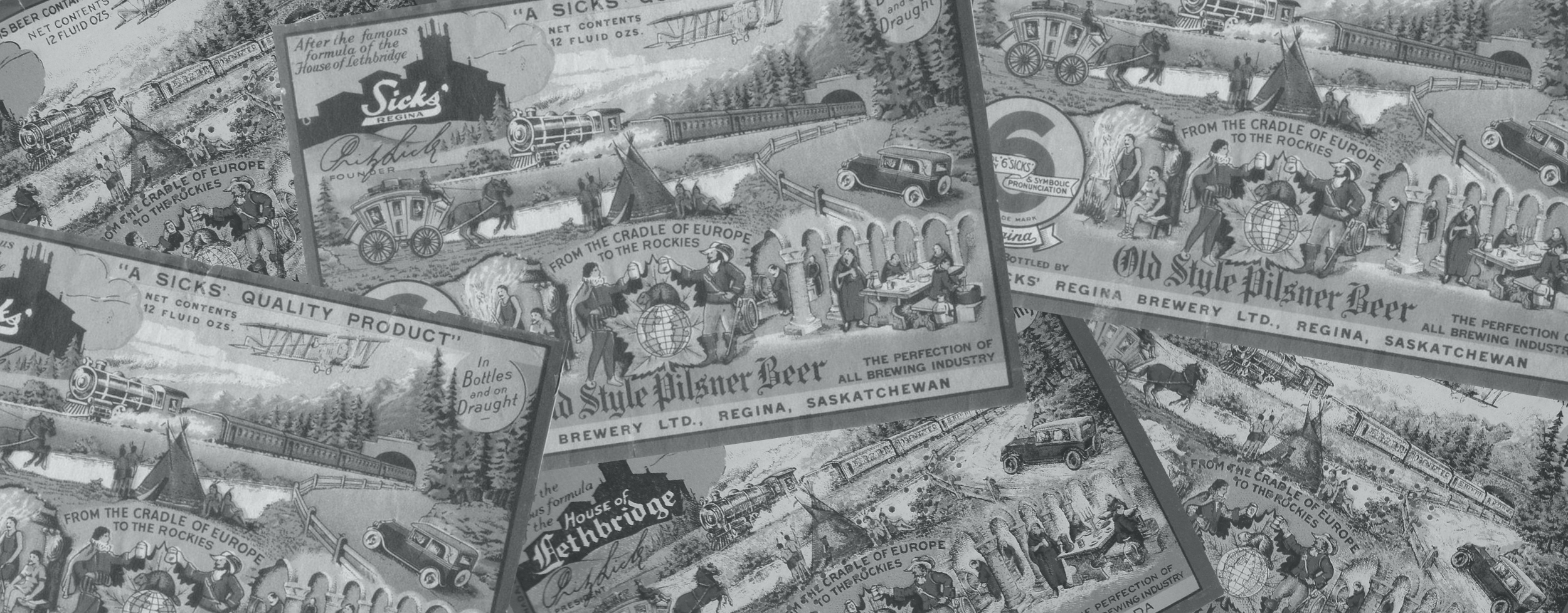
Old Style Pilsner is a renowned Canadian beer brand that has carved a niche for itself since its inception in 1926. Recognized for its iconic green label adorned with a stylized prairie landscape, Old Style Pilsner embodies the spirit of the Canadian West. This classic brew has become synonymous with camaraderie and a laid-back lifestyle.
Requirement: Ensure marked differentiation between each of the illustrations
Challenge: Maintain brand authenticity while still introducing a departure from existing graphics, acknowledge the strong loyalty of diehard Pilsner drinkers; avoid drastic changes that could alienate the existing fan base
Objective Outcome: Create a diverse set that respects brand roots while enticing collectors with visually striking, distinctly different posters that instill a desire to collect the entire set
Ideation
Having sketched thumbnails inspired by elements from the Pilsner label, I quickly observed that the images naturally fell into three categories:
Landscape
Bunny with Plane
Pilsner Flag Logo
To create cohesion among these images, I decided to render the final chosen ideas in styles reminiscent of vintage images from the early to mid-1900s, paying homage to the era when Pilsner was initially created. This approach ties the visuals together, adding a nostalgic touch that aligns with the beer's historical roots.

Poster 1:
Old Style Landscape
Striving to appeal to the most devoted Pilsner enthusiasts, I chose to illustrate the landscape concept with minimal departure from the original label. The stylized prairie landscape, a hallmark of the brand, retains its recognizability and is rendered in a woodcut aesthetic. This choice aims to resonate with the brand's loyal drinkers by preserving the iconic elements they cherish.
The artwork was created by sgrafitto technique on scratchboard. First, the image was lightly drawn on the black surface of the scratchboard and then the image is created by scratching off the black surface revealing the white backing below. The colour was added digitally after the art was complete.

Poster 2:
Bunny Aviator
While sketching various perspectives of the Pilsner bunny in the plane, I felt the plane overshadowed the bunny as the focal point. The breakthrough came when I envisioned the bunny leaping from the aircraft. Inspired by the geometric designs of the art deco era, I illustrated a stylized depiction of the bunny as a parachuter. To maintain context, the original bunny and plane icon, untouched, resides in the bottom left corner, enhancing the illustration's depth and scale.

Poster 3:
Proudly Pilsner
When I sketched the Pilsner logo flag held by a figure, I was immediately struck by how much the image reminded me of wartime propaganda posters. I refined the final image, eliminating most of the person and zooming in on the hand raising the flag. Sun rays were incorporated to spotlight the emblem and further the historical feel. I distressed the image, giving it the appearance of weathered paint on a wooden surface.

Outcome… Success!
Retail partners in Western Canada received the three variants of the 24x36 inch poster as a near-pack promotion, available with the purchase of selected cases of Pilsner. This strategy successfully kindled a desire among Pilsner enthusiasts to collect the entire set of posters. Customers returned and bought additional Pilsner cases, driving an incremental lift across Western Canada.
Due to the success of the program, the illustrations were used beyond the original scope and transitioned into diverse giveaway and contest merchandise. This ensured sustained engagement and brand visibility beyond the initial promotion, marking a dynamic and successful marketing initiative.


